The most trusted Scrum Alliance training that now anyone can afford.
ThinkLouder has trained 55,000+ Scrum Masters, Product Owners, and Agile practitioners since 2001. Scrum Alliance certified, taught by a practicing AI + product consultant, starting at $349.
Trusted by practitioners at


The landscape has shifted
Agile is changing. Your training should keep up.
Scrum and Agile are still how most product teams ship. But the landscape has shifted. Product organizations have reshaped roles, the Product Operating Model is changing how leadership thinks, and AI is rewriting every process Scrum Masters and POs run.
Too many training companies are still teaching 2015 Scrum. Too many "modern" thought leaders dismiss Scrum entirely and leave practitioners stranded.
We're the middle path. Certified by Scrum Alliance. Fluent in Product Operating Model thinking. Actively integrating AI into how our students work. And honest about what's changing and what isn't.
What we offer
Three ways we serve practitioners and teams.
Get the cert your career needs.
CSM, CSPO, A-CSM, A-CSPO. Scrum Alliance credentials. Live virtual in flexible formats: 2-day, 3 half-day, 4-day evening, and weekend classes. Starting at $349.
Browse Classes →Stay current. Stay relevant.
Scrum-to-Product transition workshops. Product Operating Model fundamentals. For practitioners ready to level up.
See Training →Coach your team into a high-performing one.
Private team training, ongoing coaching retainers, transformation consulting. We don't just certify. We coach through the hard parts.
Talk to Us →Why ThinkLouder
Six reasons practitioners choose us.
55,000+ students since 2001
25+ years of Scrum Alliance training. More practitioners have trusted ThinkLouder than most providers have ever seen.
Scrum Alliance Licensed Training Provider
Officially licensed to deliver Scrum Alliance certifications. Your cert is real and recognized globally.
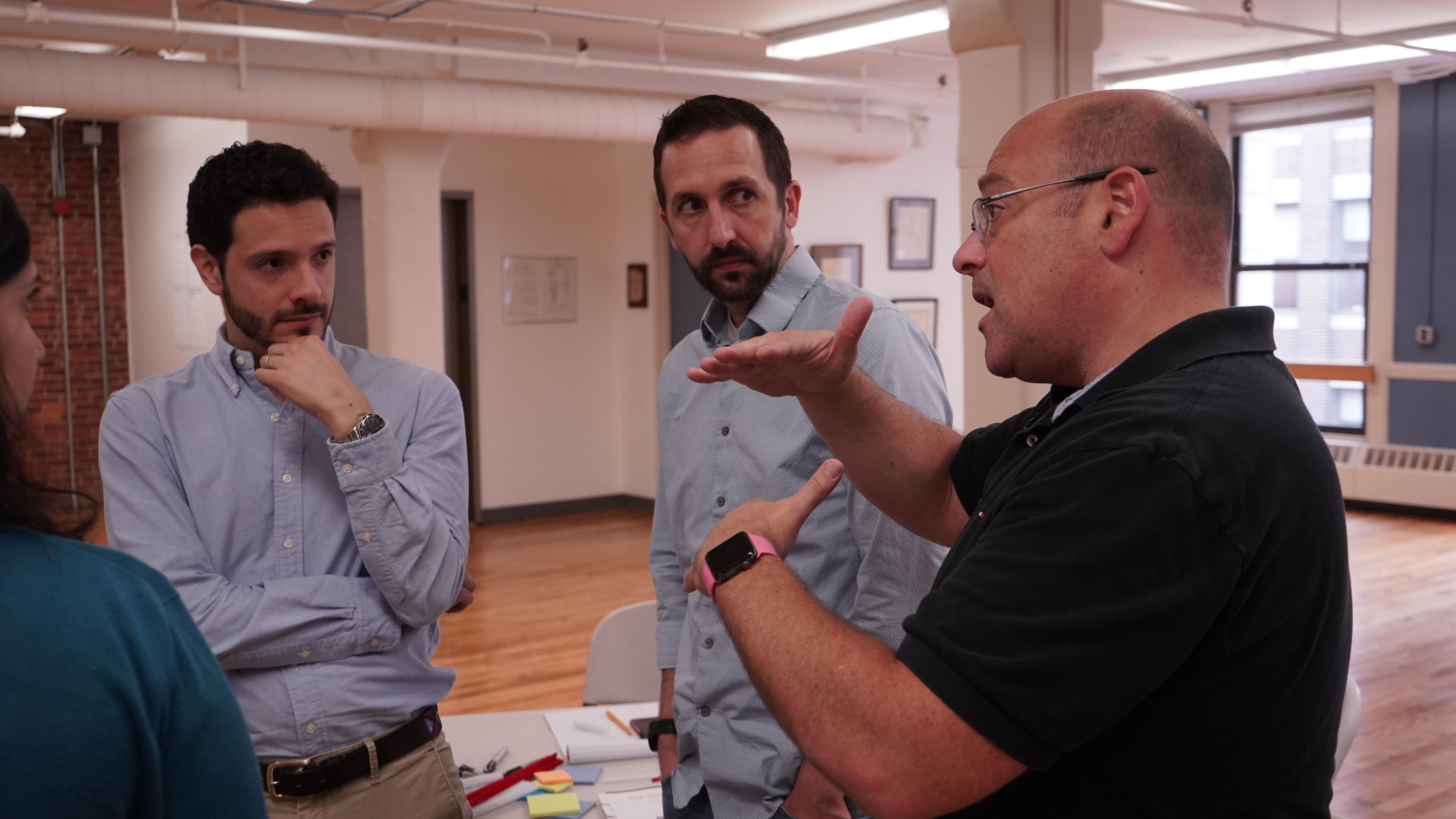
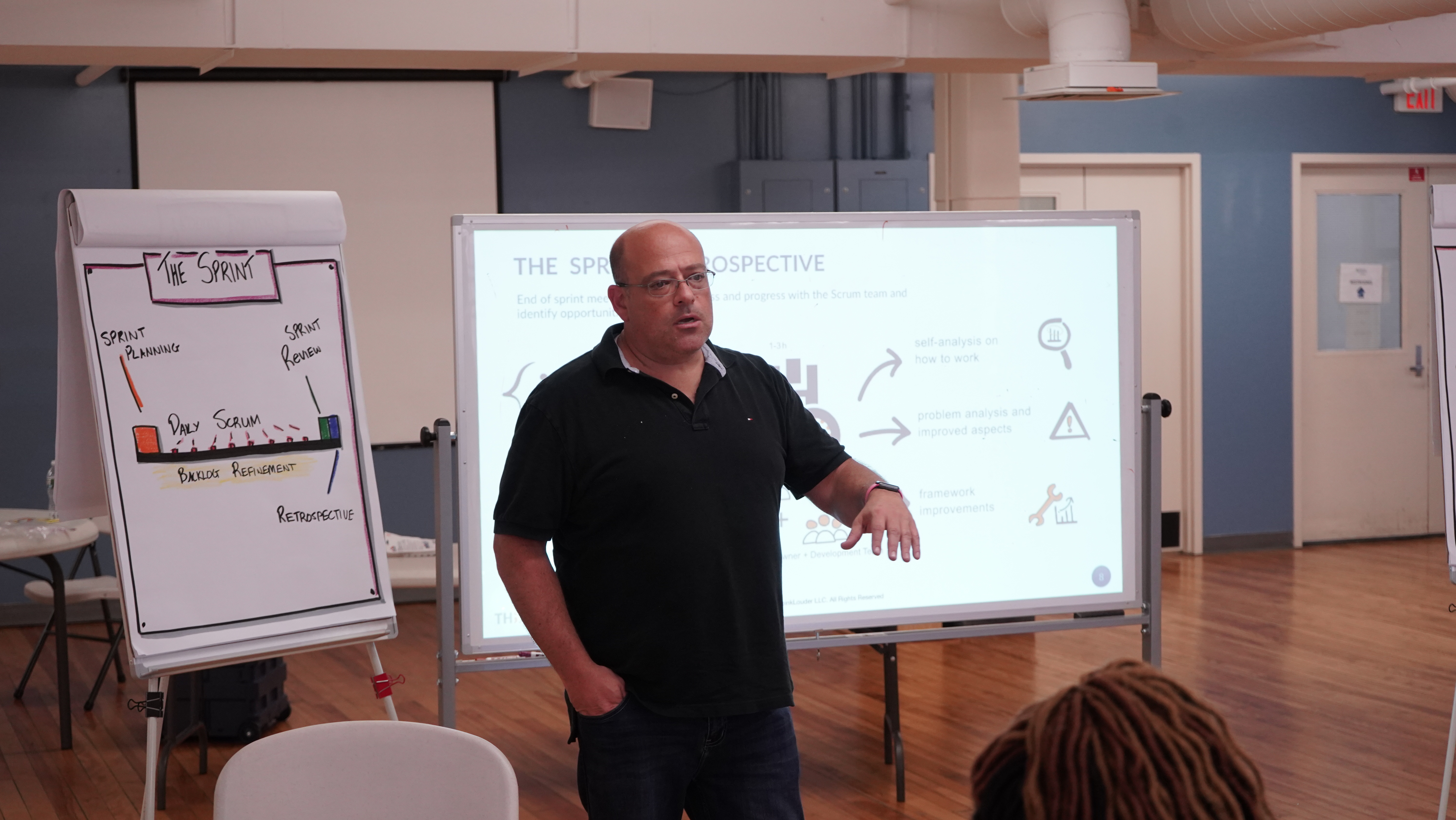
Taught by a practitioner, not a script
Giora runs SimplerLabs (AI training) and Make Bolder (AI implementation). What he teaches is what he does this week.
Built for the real job
You leave with skills you can apply Monday morning. No abstract theory that collapses on first contact with your actual team.
A career partner, not just a class
Scrum Masters evolving into product. POs stepping into leadership. We've mapped the transitions, and we're in them with you.
Accessible pricing that respects you
Classes start at $349. We deliberately priced ThinkLouder so practitioners could afford their own career growth.
More than training
Beyond the Cert: Real Work, Real Careers
A certification gets you in the door. What happens on Monday is what actually matters. We train for the real job, and we stay with you as your career evolves.
CSM → CSPO → 1:1 coaching through the transition
CSM refresh → advanced workshops → ongoing community
A-CSM → POM fundamentals → mentorship
Representative career arcs based on common ThinkLouder alumni paths.
What our students say
Verified reviews from real practitioners.
"Giora was fantastic. He was extremely intentional, clear, and flexible dependent on the desires of our class. His industry + teaching experience combined to leave each of us engaged and receptive to learning more."

"Giora is a great instructor. Everything was explained and discussed in detail to make sure everyone was on the same page. I can't stress enough how interactive the class is and how you learn by participating instead of just reading the documentation."

"Fantastic experience! I enjoyed the class and Giora was really on point with good examples and activities. Passed the exam first try."

"Giora Morein is an outstanding instructor. He takes the time to thoroughly explain theories and concepts, ensuring everyone truly understands the material. His teaching style is both engaging and effective. I highly recommend ThinkLouder."

Get started
Upcoming Classes
15+ classes available every month. Live virtual. Small groups.
Loading upcoming classes…
Browse the full schedule to see what's available this month.
Who's teaching
Giora Morein

Giora has been training Scrum Masters, Product Owners, and Agile teams since 2001. He's Scrum Alliance credentialed and runs SimplerLabs (AI training) and Make Bolder (AI implementation), where he trains, teaches, and does AI-assisted product work in the real world.
He teaches Scrum the way it actually gets used, not the way the textbooks describe it. Supported by a bench of vetted co-instructors who meet the same standard.
Common questions
FAQ
Is this an official Scrum Alliance certification? +
What's the format? +
How is this different from a cheaper CSM class? +
Do you offer team / corporate training? +
What happens after the class? +
Ready to get certified, or to coach your team?
55,000+ practitioners started here. Classes start at $349. Your team's transformation starts with a conversation.
From the blog
Latest Insights
Why Organizations Choose Certified Scrum Trainers
Learn what sets Certified Scrum Trainers apart, how they're vetted, and why CST training delivers real results for Agile teams.
Certified Scrum Master: What You Need to Know to Lead Teams
Learn what a Certified Scrum Master does, why CSM training matters for team performance, and how to choose the right Scrum training provider.
What a Certified Scrum Trainer Actually Does (And Why It Matters for Your Organization)
Learn what a Certified Scrum Trainer does, how they drive real Agile transformation, and what to look for when choosing a CST for your organization.